We started this series with one number: the Realized Price, the average price the entire market paid for its bitcoin. That single number is genuinely powerful — but it hides everything underneath it. This final article pulls back the curtain on what that average is averaging across: the Cost Basis Distribution, a full map of where every coin in existence was last bought.
Think of the Realized Price as the mid-point on a scale. The Cost Basis Distribution (CBD) shows you the actual shape of what is sitting on each side of that scale — how much bitcoin is clustered at $10,000, how much near $50,000, how much near $120,000. Once you can read that map, the whole market starts to make sense at a glance.
From average to distributionWhat the CBD actually is
The Cost Basis Distribution is built from the same raw data that powers every metric in this series: the cost-basis stamp on each coin. Instead of collapsing all those stamps into a single average, the CBD asks a different question: how much BTC has its cost basis in each price bin right now?
Imagine sorting all ~20 million bitcoin into buckets labeled by the price they last moved at — a $1,000-wide bucket for every price level from a few hundred dollars up to $126,000. Count how many BTC land in each bucket. Plot those bucket heights as a colour gradient against a price axis. Do that for every day in history. Now you have the CBD heatmap.
- X-axis: time (date).
- Y-axis: price level on a log scale, from the cheapest coins to the most expensive.
- Color: how many BTC have their cost basis in that price bin on that date. The rule is the same whichever theme you read in: the hotter the colour, the more supply sits there, and bins holding almost nothing fade into the chart background. The light theme uses the Soft Rainbow scale (white → pale blue → green → deep red); the dark theme uses Plasma (deep violet → orange → bright yellow).
The Realized Price you learned in Part 1 is simply the supply-weighted average of this entire heatmap — one number summarising the full picture. MVRV (Part 2) compares today's price to that average. The LTH/STH split (Part 3) separates the map's old deep bands from its fresh diagonal. SOPR and Realized P/L (Parts 4–5) track what happens the moment a coin crosses from one band to another. NUPL (Part 6) measures how much of the distribution sits above or below the current price line. The halving (Part 7) explains why the distribution migrates upward in a predictable four-year rhythm. The CBD is the map that all of those metrics navigate.
Key idea
Every metric in this series is a different way of reading this one picture. Realized Price is its supply-weighted average. MVRV and NUPL compare today's price to where the bulk of the distribution sits. LTH and STH separate old bands from new ones. SOPR tracks coins as they cross the current price line. The CBD is the source.
Reading the mapSupply walls, faint gaps, and what they mean
Once you know what the axes mean, four patterns jump out immediately.
Supply walls — hot horizontal bands
A hot band — the most intense colours on the scale — running horizontally across the chart means a large number of coins were bought at that price level and have stayed there — their owners haven't moved them since. This is sometimes called a "supply wall," and it behaves like a physical wall in the market for a straightforward reason.
Coins below today's price are sitting in profit. Those holders are unlikely to sell at a loss — they can afford to wait. A dense cluster below price therefore acts as support: if price falls toward that level, many holders will see their profit shrink but still won't capitulate, and buyers may step in to defend their own cost basis. The hotter the band, the stronger the support.
Coins above today's price are sitting at a loss. Those holders are underwater. A dense cluster above price is overhead supply (or overhead resistance): as price rises toward that band, many holders who have been waiting to break even will sell the moment they see a profit again. That selling pressure can cap or slow the rally. The hotter the band, the heavier the resistance.
The fresh diagonal — coins re-stamping at market
Look for the warm diagonal ribbon that hugs the current price and moves up and down with it in real time. This is the most recently moved supply continuously re-stamping its cost basis at the prevailing market price. Short-term holders (Part 3) live here. During strong rallies this diagonal heats up as more coins trade hands at new highs. During capitulations it cools and fades as fewer people want to buy.
Faint gaps — where price can run
A faint, washed-out band — fading into the chart background — means very little supply has its cost basis at that price level: either price barely paused there on the way up (so few people bought at that level), or those coins have since moved and re-stamped elsewhere. Faint gaps are thin air: when price is moving toward a faint region, there is little accumulated cost-basis to slow it down, and price can move quickly through those levels in either direction.
Dense clusters and the profit / loss divide
Draw a horizontal line across the heatmap at today's price. Every warm band below that line is supply in profit. Every warm band above that line is supply at a loss. When most of the warm colour sits below the price line, the market is broadly in profit — the distribution is said to be "in the money." When most of it sits above, the market is broadly underwater. That ratio, aggregated into a single number, is exactly what NUPL measures.
The recent viewTwo years around the cycle top
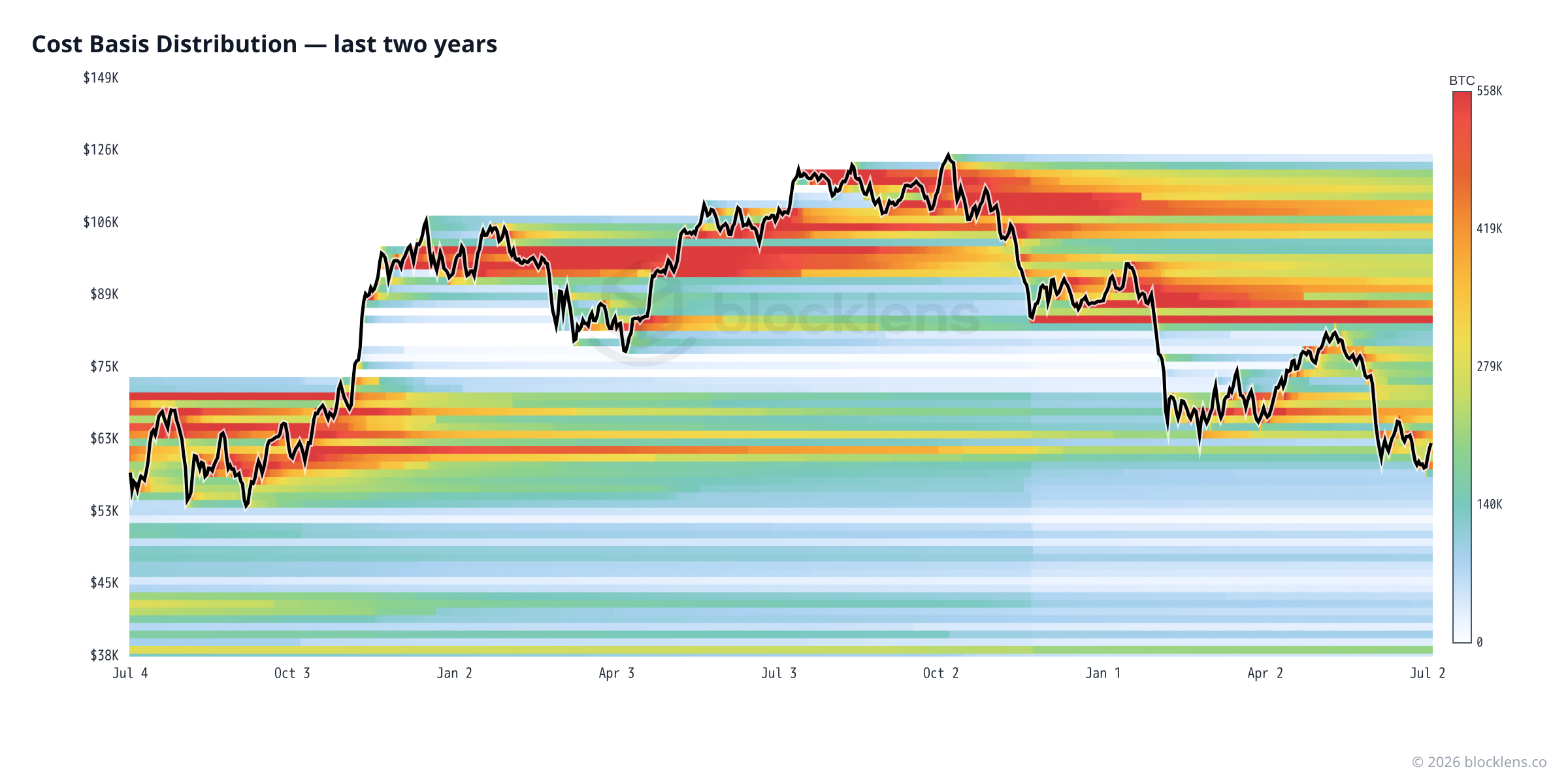
Focus on the past twelve months and the picture is dominated by two features. First, a heavy band of supply concentrated near the all-time high of $126,198 (the daily high of 6 October 2025). Millions of coins changed hands as Bitcoin ran to that peak — and those coins have not moved since, which means their owners are still holding at a cost basis near or above current price. With price now around $62,830 — roughly 50% below that band — it forms a substantial overhead resistance zone.
Second, a warm fresh diagonal along the right edge of the chart — coins that have moved recently and re-stamped near current price. Those are the short-term holders who have accepted today's price as their entry point, and they form the foundation of near-term support just below market.
The gap between those two features — a large faint region spanning roughly $60,000 to $95,000 — is where price has been trading back down through on its way from the all-time high. Not much supply re-anchored in that corridor, which is why price moved through it with relatively little friction.
Five yearsThe macro view — one full cycle
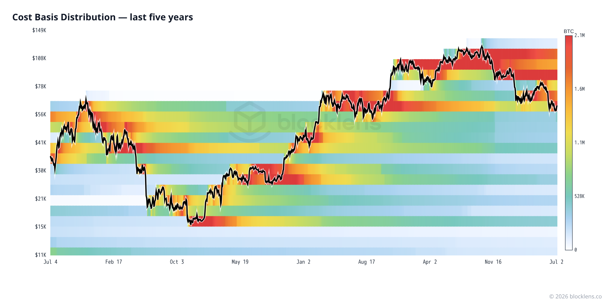
The macro view is where the CBD really earns its place as the capstone metric. You can trace the whole cycle: supply gradually migrating upward as the bull market brings new buyers in at progressively higher prices; then the sharp reset of the bear drawing out a new cluster of buyers at the lows who anchor the next base. The deepest supply visible here — the $15,000–$30,000 bands laid down around the 2022 bottom — plus the even older, cheaper coins resting below the frame of this chart form the bedrock. As long as those bands persist, that supply underpins the entire market structure.
You can also see the cyclical pattern from Part 7 playing out visually: each halving is followed by a bull market that stacks a new hot band at the next price tier. The 2021 cycle left a band around $60,000 that became heavy support for the 2024–2025 run-up. The 2025 peak at $126,198 is now the newest overhead band — waiting to be absorbed or broken in the next cycle.
The interactive heatmap on Blocklens · ENTERPRISE
The Cost Basis Distribution is an Enterprise-tier metric on Blocklens — the full interactive heatmap with per-period bin optimization (from one week to all history) is available to Enterprise accounts. It draws on the same raw cost-basis data that powers Realized Price and MVRV — just displayed as a full distribution instead of a single summary number. The alternative name you will see in academic literature is URPD (Unspent Realized Price Distribution), which emphasises that it only counts coins that haven't been spent yet (i.e., are still held). All names refer to the same underlying picture.
Reality checkWhat the data says today
Here is how the CBD picture translates into the specific numbers on 4 July 2026:
| Metric | Value | Plain-English meaning |
|---|---|---|
| Market price | ≈ $62,830 | The current price line on the CBD map |
| Realized Price | ≈ $53,080 | The supply-weighted average of the entire CBD |
| Supply in profit | ≈ 44% | Share of coins whose cost basis sits below today's price |
| Supply at a loss | ≈ 56% | Coins whose cost basis sits above today's price — mostly bought near the ATH |
| MVRV | ≈ 1.19 | Price is ~19% above the CBD's average — mild profit overall |
| ATH overhead band | ≈ $126,200 | The heaviest resistance zone — large supply bought at the Oct 2025 peak ($126,198 daily high) |
Here is the interesting tension in today's data, the same puzzle introduced in Part 1: MVRV says the average holder is about 19% in profit, yet only ~44% of coins are actually in profit. How? Because the distribution is not symmetrical. A relatively small group of very old, very cheap coins (bought at $5,000, $10,000, $20,000) is so deeply in profit that it pulls the average up well above the Realized Price. Meanwhile, everyone who bought in the final surge toward $126,198 is sitting on losses that drag the coin count well below 50% in profit. The CBD makes this split immediately visible — the heavy band near the ATH above today's price dwarfs most of the older bands below it.
In practical terms: the path of least resistance upward is blocked by that ATH overhead band. A sustained return to all-time highs would require that supply to either be absorbed by new buyers at higher prices, or for those holders to capitulate and sell, resetting their cost basis lower. The path downward is cushioned by the older bands in the $10,000–$50,000 range, where long-term holders have deep cushions and little incentive to sell.
Wrapping upEight parts, one framework
Eight articles ago, we started with a single observation: every bitcoin records the price it last moved at. From that one fact, we derived Realized Cap and Realized Price (Part 1), learned to read MVRV as a cycle gauge (Part 2), separated patient long-term holders from recent short-term buyers (Part 3), watched coins signal profit and loss the moment they are spent via SOPR (Part 4), measured the aggregate flood of profit-taking and capitulation in Realized P/L (Part 5), tracked market psychology through NUPL (Part 6), understood the four-year halving cycle that drives supply scarcity (Part 7), and arrived here at the full Cost Basis Distribution — the complete map that all of those metrics navigate.
The CBD is both the simplest and the deepest thing in on-chain analysis. Simple, because it is just a count of coins sorted by the price they last moved at. Deep, because that sorting reveals the actual structure of the market — where the holders with conviction sit, where the nervous money is concentrated, and which price levels have the gravitational weight to slow or stop a trend. Learning to read it is the point where on-chain analysis stops being a collection of indicators and starts being a coherent picture of the market's memory.
All the live charts in this series — including the interactive CBD heatmap — are available to explore at blocklens.co/lab. The data updates daily. The picture is always changing. Now you know how to read it.
Putting it to workThe actionable takeaway
How to use the cost-basis map
Trade the walls, mind the gaps. Hot bands below price = support (holders in profit rarely sell at a loss). Hot bands above price = overhead resistance (underwater holders sell to break even) — today a heavy band sits near the $126,198 top, capping rallies. Faint zones = thin air, where price can move fast in either direction. The band you are trading against is the same supply that drives Realized Price, MVRV, and the LTH/STH split — so the CBD ties the whole series together.
Caveat: structure shows where supply has tended to react, not a guarantee it will again. Not financial advice.
Mini-glossary
- Cost Basis Distribution (CBD)
- A map showing how much BTC has its cost basis (last purchase price) at each price level, displayed as a heatmap over time. Also called URPD.
- Supply wall
- A hot horizontal band in the CBD heatmap (the most intense colours on the scale) — a price level where large amounts of BTC were bought and have remained unspent. Acts as support below price or resistance above price.
- Overhead supply
- BTC whose cost basis sits above the current market price. These holders are at a loss and may sell to break even when price rises back to their entry, creating resistance.
- Support / Resistance
- Price levels where the market has historically struggled to fall through (support) or push above (resistance), explained in on-chain terms by the density of cost-basis supply at those levels.
- URPD
- Unspent Realized Price Distribution — the academic name for the same chart as the CBD. "Unspent" means only coins currently held (not yet moved again) are counted.
The On-Chain Basics series
- What on-chain analysis is — the cost-basis ledger
- Long-term vs. short-term holders (LTH / STH)
- MVRV in depth — reading "cheap vs. expensive"
- SOPR — what coins reveal the moment they're spent
- Realized profit & loss — capitulation and euphoria
- NUPL — the psychology of a market cycle
- Bitcoin's cycles — the halving and the four-year rhythm
- The cost-basis "walls" — reading supply by price You are here