If you have ever looked at a Bitcoin price chart, you have seen what the market is doing. On-chain analysis tells you something a price chart never can: what people actually paid, when they bought, and whether they are sitting on a profit or a loss right now.
This is the first article in an eight-part series. We are going to build your understanding from the ground up — no jargon left unexplained — until you can read the same metrics that professional analysts use to spot market tops, bottoms, and everything in between. We start here, with the single idea that everything else rests on.
The problemA price chart tells you "what", not "who" or "at what cost"
A normal candlestick chart comes from exchanges. It records four things per day: the open, the high, the low, and the close — plus trading volume. That is genuinely useful, but it is also everything the chart knows. It cannot tell you:
- How many coins haven't moved in years versus changed hands yesterday.
- What price the current holders originally paid.
- Whether the average owner is in profit or underwater today.
In the stock market, you simply cannot answer those questions — ownership records are private. Bitcoin is different, and the difference is its superpower.
The foundationThe blockchain is a public ledger — and every coin is timestamped
Bitcoin's blockchain is a complete, public, append-only record of every transaction since 2009. Anyone can download it. Crucially, every unit of bitcoin sits in the ledger marked with the exact moment it last moved.
Think of each coin as a banknote that automatically stamps itself with today's date every time it changes hands. Because we also know Bitcoin's price on every date in history, that timestamp gives us something powerful for free: the price at which each coin last changed owners — its cost basis.
The one idea to remember
If a coin last moved on a day when BTC was $8,000, then $8,000 is that coin's cost basis. On-chain analysis is, at its heart, the study of millions of these cost-basis stamps added together.
A quick note on vocabulary you'll see everywhere: analysts often say "coins" when they really mean the bundles the ledger actually tracks, called UTXOs (unspent transaction outputs). You don't need the technical detail yet — just hold onto the picture of self-stamping banknotes. When a coin sits still, its stamp stays frozen at its old price. The moment it moves, the stamp resets to today.
First metricFrom one coin to the whole network: Realized Cap
Let's scale that single-coin idea up to all ~20 million bitcoin in existence. There are two ways to add up "how much is all the Bitcoin worth," and the gap between them is where on-chain analysis begins.
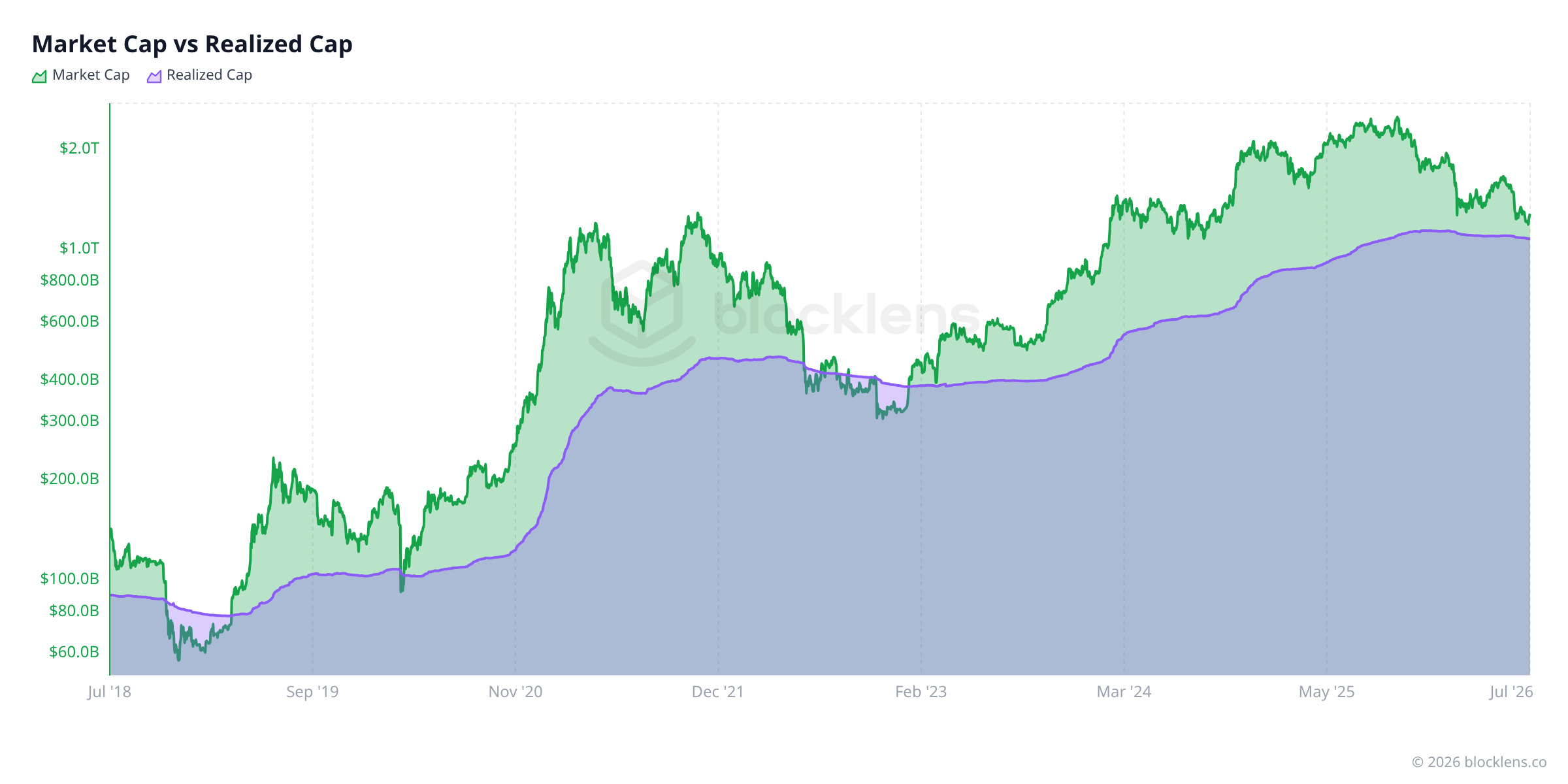
Market Cap is the familiar one. Take today's price and multiply by every coin in circulation:
$$\text{Market Cap} = P_t \times \text{Supply}_t$$This values every coin — even ones that haven't moved since 2013 — at today's price. It answers: "What is the network worth right now, on paper?"
Realized Cap asks a smarter question. Instead of today's price, value each coin at its own cost-basis stamp — the price when it last moved — and add those up:
$$\text{Realized Cap} = \sum_{i} a_i \times P(\tau_i)$$Here each coin i holds an amount a i, last moved on date τ i, and P(τ i) is Bitcoin's price on that date. In plain English: Realized Cap is the total amount of money that actually flowed into Bitcoin to put every coin where it is today. It is the network's aggregate cost basis — what everyone, collectively, really paid.
Why this matters
Market Cap is opinion — it re-prices old coins at today's mood. Realized Cap is history — it remembers what was really paid. When the two drift far apart, the market is either euphoric or fearful relative to its own cost basis. That gap is the engine behind almost every on-chain signal you'll meet later.
Second metricRealized Price: the average price the market actually paid
Realized Cap is a giant dollar number, which makes it hard to feel. So we divide it by the number of coins to get a price per bitcoin — the Realized Price:
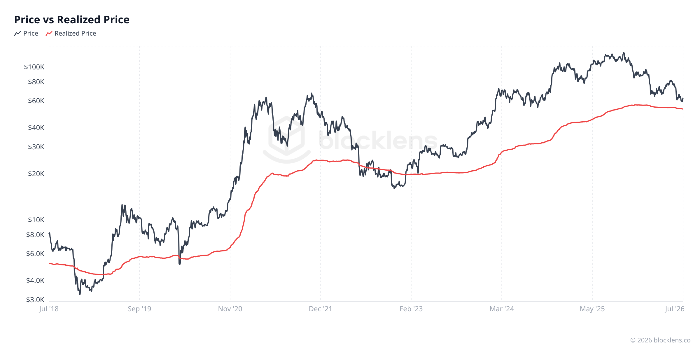
$$\text{Realized Price} = \frac{\text{Realized Cap}}{\text{Circulating Supply}}$$This is one of the most useful numbers in all of on-chain analysis, because it has a dead-simple meaning: the average cost basis of every bitcoin in existence. If you could ask every holder "what did you pay?" and average the answers (weighted by how many coins they hold), you'd get the Realized Price.
That instantly gives us a profit-and-loss line for the whole market:
- Price above Realized Price → the average holder is in profit. Historically a confident, bullish regime.
- Price below Realized Price → the average holder is underwater. Historically this only happens in deep bear-market capitulation — and it has marked generational buying zones in late 2018, March 2020, and late 2022.
- Price ≈ Realized Price → a knife-edge where aggregate profit flips to loss. It often acts as major support or resistance.
Putting it togetherMVRV: one ratio that says "cheap or expensive vs. cost"
If price-above-cost is bullish and price-below-cost is a bottom signal, the natural next step is to measure how far price sits from cost. Divide the two caps — and you get the single most famous on-chain ratio, MVRV (Market Value to Realized Value):
$$\text{MVRV} = \frac{\text{Market Cap}}{\text{Realized Cap}} = \frac{P_t}{\text{Realized Price}}$$It's just the two numbers you already understand, stacked into a ratio:
- MVRV = 1 → price sits exactly on the network's cost basis.
- MVRV > 1 → the market is in aggregate profit (e.g. 1.5 = up 50% over cost).
- MVRV < 1 → the market is in aggregate loss — the capitulation zone.

Reality checkWhat the data says today
Let's ground all of this in live numbers. Here is the Bitcoin network on 4 July 2026, straight from the Blocklens API:
| Metric | Value | Plain-English meaning |
|---|---|---|
| Market price | ≈ $62,830 | What one bitcoin trades for right now |
| Market Cap | ≈ $1.27T | Price × all ~20.05M coins (worth on paper) |
| Realized Cap | ≈ $1.064T | What the whole network actually paid |
| Realized Price | ≈ $53,080 | Average cost basis per coin |
| MVRV | ≈ 1.19 | Market sits ~19% above cost basis |
| Supply in profit | ≈ 44% | Share of coins worth more than they cost |
Read it as a story: the average bitcoin was bought around $53,080, the price today is about $62,830, so the network as a whole is roughly 19% in profit (MVRV 1.19). This is a mild, lukewarm-profit regime — a long way from the euphoria of a top, but also above the cost-basis floor that marks bottoms. For context, price is currently about 50% below its all-time high of $126,198 (the daily high of 6 October 2025).
A puzzle that powers the rest of the series
If the average holder is up 19%, why is only ~44% of supply actually in profit? Because "average" hides a split: coins bought cheaply years ago are deep in profit and pull the average up, while everyone who bought near the all-time-high top is now well underwater. Separating those groups — recent buyers versus long-term holders — is exactly what the next article, Part 2, is about.
Mini-glossary
- Cost basis
- The price a coin last changed hands at — what its current owner effectively paid.
- Market Cap
- Price today × all coins. The network's worth "on paper."
- Realized Cap
- Every coin valued at its own cost basis, summed. The total money actually paid into the network.
- Realized Price
- Realized Cap ÷ supply. The average cost basis of one bitcoin.
- MVRV
- Market Cap ÷ Realized Cap. How far price sits above (>1) or below (<1) the network's cost basis.
- UTXO
- The "chunk" of bitcoin the ledger actually tracks. For now, picture a self-stamping banknote.
The On-Chain Basics series
- What on-chain analysis is — the cost-basis ledger You are here
- Long-term vs. short-term holders (LTH / STH) Next
- MVRV in depth — reading "cheap vs. expensive"
- SOPR — what coins reveal the moment they're spent
- Realized profit & loss — capitulation and euphoria
- NUPL — the psychology of a market cycle
- Bitcoin's cycles — the halving and the four-year rhythm
- The cost-basis "walls" — reading supply by price